Fact: You could have the best product in the world, but it will never receive the plaudits and exposure it deserves without a professional branding.
In 2014, Chronos Studeos Architects produced the 3D visualizations of Amethyst Hall, a new hall of residence for University students in Lagos.

However, our involvement in the project didn’t end with the successfully delivery of the renders, as well as the building and development by our media team of a new website at amethysthall.com.
The new brief for our in-house design team?
To give Amethyst Hall its identity.
Here’s how we delivered.
1. Longevity = Brand recognition

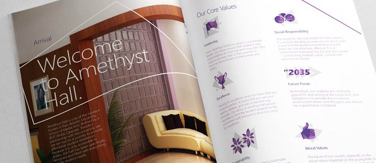
We settled on purple as our primary colour for Amethyst Hall’s branding (and elements of the exterior in the 3D visualizations) as purple is the colour of the amethyst stone.

A combination of blue and red, purple has long been recognised as a symbol of strength, nobility and even royalty. Of most importance to us, though, is the fact purple is also associated with ambition – the very characteristic of all those who are embracing education as a path to a better life.
Whenever the Chronos Studeos team undertake any kind of branding project, we always deliver a wide range of examples of how the design will look on everything from the building itself to potential promotional items or gifts, such as pens and mugs.
2. The target audience

Because Amethyst Hall is ultimately a halls of residence for young people, it was obvious from the outset that the branding needed to be very much of the 21st Century – impactful, sleek and modern.
Set against a white background to ensure the branding stands out, our design team opted for a very uncluttered, clean design encompassing bold lines. The main element was something akin to an arrow, an unconscious representative of the future direction of all those students who would reside at Amethyst Hall.
3. Branding as the first hello

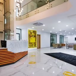
See this photo (above). It’s the reception desk inside Amethyst Hall. Despite what you may think, this isn’t the first point of contact.

Before any words have even been spoken or handshakes exchanged, a company or institution (in this instance the halls of residence) is relying on the branding to convey a silent, friendly and positive ‘message’ to the wider world.
Think of it this way: How often have you picked up a food product before you’ve ever tasted it, simply based on the fact you like the way it’s packaged?
That is the power of branding and promotion.
4. Be consistent.


Every day we’re all bombarded by so many variations of, well, just about everything. This means stability and consistency is an increasingly valuable currency. This is why the world’s most famous companies – from Coca Cola to Apple – rarely, if ever, tinker with their branding (or logos).
People like stability.
In business, it’s crucial to get the branding right from the outset and stick with the same colour scheme and design for the long term.
People like familiarity.
Once people can almost instantly match the branding to a company name they increasingly feel comfortable and happy to invest either time or money in that brand.By opting for a timeless style – simple and sleek, rather than fancy and overly fussy – branding such as that seen on the interior signage for Amethyst Hall won’t age and ultimately appear old fashioned.

Don’t forget the following fact when thinking about consistency in design.
Brand association and long-term recognition is vital.
It really is as simple as that. This is why it’s unwise to start tinkering with a successful logo once it’s out there in the wider public domain.
5. Keep it simple
Once the exterior and interior signage displaying the building’s name was complete, it was time for the Chronos Studeos graphic designers to swap large words for bold symbols in the designs for the smaller indoor signage.
Because it was necessary to include text in the form of numbers in the above sign, it was a no brainer that we needed to retain the clean format by not incorporating yet more text with the word ‘Bedrooms’.
Much better to instead design a fun interpretation of a sleeping figure on a bed.


Of course, in an establishment such as Amethyst Hall, it’s a necessity rather than a design choice to include informative text on signs.
However, as many graphic designers would concede, “Less really is best.”
Being professional graphic designers, our team successfully managed to retain a beautifully simple, but classy, design right across the variety of signs.
Success!
The winning formula we followed for the interior signage of Amethyst Hall was essentially to incorporate three aspects:
- Text in the form of a word or numbers, but not both (as this make the design too busy)
- A clean but strikingly effective geometric background incorporating no more than three shades of our primary colour of purple
- A fun, Apple-Esque symbol to denote location, such as the cup of coffee for the kitchen or the pair of glasses for the reading room
Until next time…


So, that’s how we rounded up our work on the huge undertaking that was project Amethyst Hall.
- Yes, it was challenging.
- Yes, it was exhausting.
- Yes, it was all-consuming.
Nevertheless, most of all…
We feel proud.
Meet Our Team
The following Chronos Studeos team mates worked to ensure the success recorded on this project:
![Chronos Studeos Architect Hassan Anifowose]()
 Hassan Anifowose
Architect, Visualiser & Animation Supervisor at Chronos Studeos
LinkedIn profile
![Oluseyi Olusanya]()
 Oluseyi Olusanya
Graphics Lead at Chronos Studeos
LinkedIn profile


I thought I was gonna see an array of pictures on how the project was carried which includes the conceptualization stage to the construction complection stage.