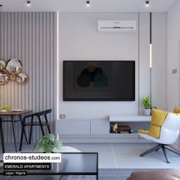
Colour combination is a powerful determinant of how people experience spaces. It directs the flow, energy and perception people have when they interact with a room. When making colour selections for your interior design it is advisable to stick to a colour palette that is befitting to the spatial functions, suitable for the room’s size and reflects the mood you want the room to exhibit.
Sticking to a chosen colour palette will help you to maintain a reasonable amount of consistency within the space and subtly define individual features, bearing in mind that every component of the space reflects the colours which make up the whole design either as contrasting or complementary additions – starting with an accent colour and working around this to beautify the room. Here, we’ll be showing you 3 powerful colour palettes that can be applied to create a captivating interior design.
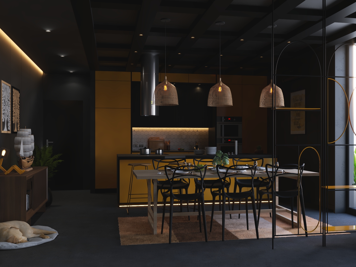
Darks
One beautiful feature of a dark colour is in its ability to absorb light. A dark shade is never a bad idea, as in this case, shadows are less legible. As a preventive measure when a space looks gloomy, adding light-reflective materials is very important. However, darker shades rely on contrasting textures in creating interest more than lighter colour schemes.
When using darker colour palettes, carefully choose materials that have reflective qualities. It is an awesome idea to use a mirror, but using a metallic wouldn’t be bad either. This is because it will not only lift a dark interior instantly, it would also come with it an air of drama, inviting interest.
Lighting will also have a big impact on the visual qualities of each texture you choose. So, it is important that you layer your lighting and highlight areas within your space with wallpapers and wall lamps. Also, you could get some natural elements such as plants. This helps bring out the life in our spaces. Rooms that are exposed to a lot of natural light work well with darker colour shades.
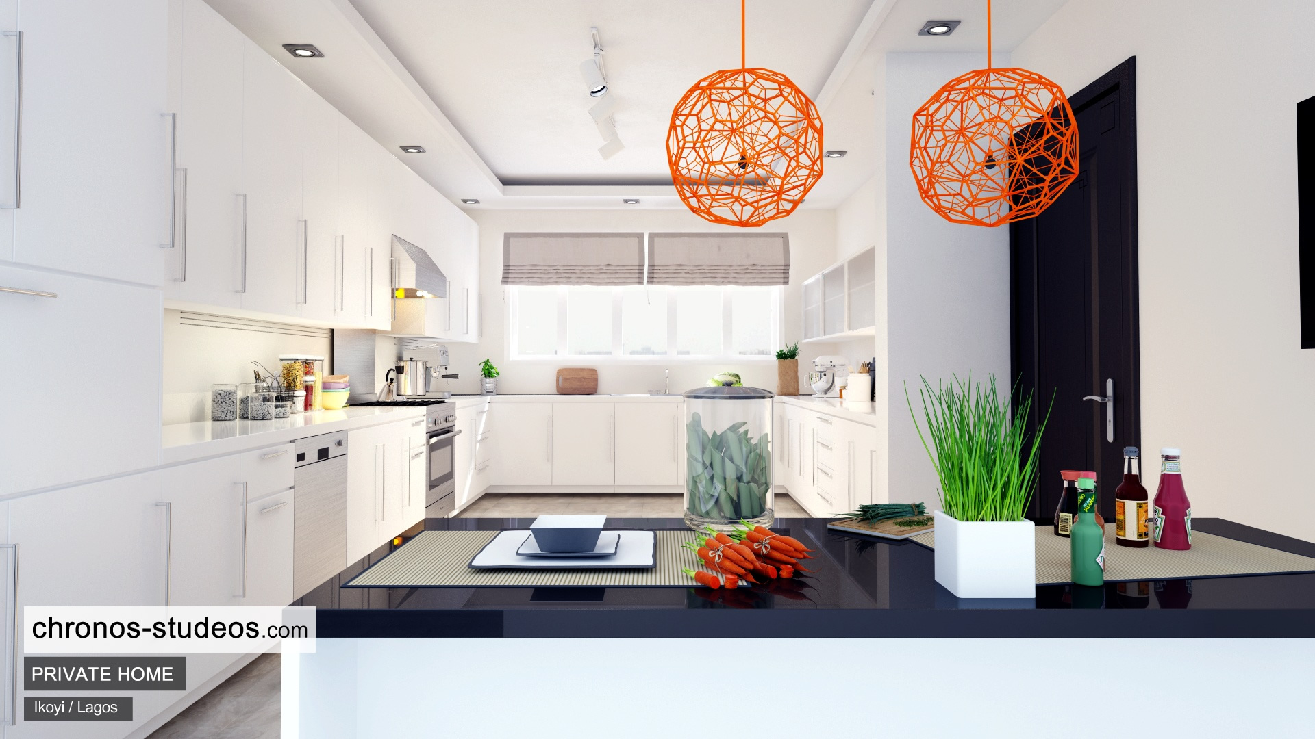
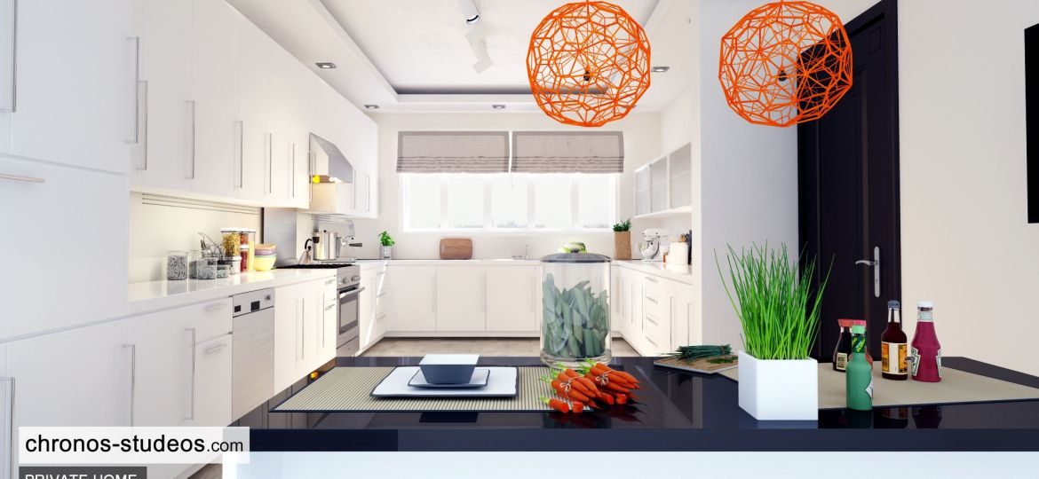
Whites
Have you not noticed that textures are more pronounced when white colour palettes are used? It is even more beneficial if your room is exposed to plenty of natural light, the contrast in textures will be even stronger. Using contrasting textures is really important with whites to provide high-quality definition and interest.
Combining visual and tactile textures within white schemes makes an area look more defined. Light-reflecting surfaces mixed with natural elements like wood will contrast and create interest.
Wood is a great element to use in making a white space look less cold. Rough, heavier textures have a way of adding balance and visual weight to a white colour scheme, making it feel more intimate and grounded.
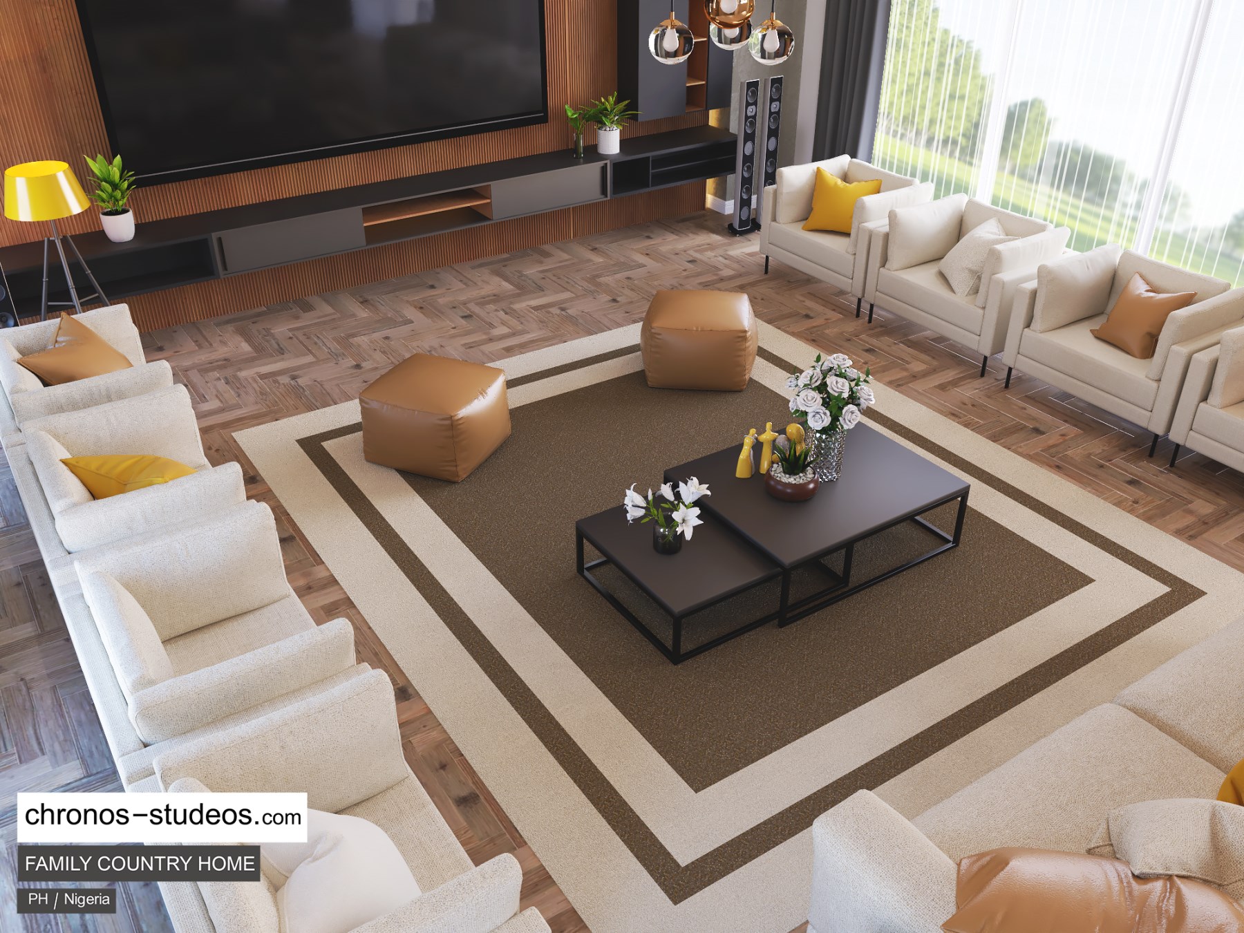
Neutrals
There is a high chance of your spaces looking very bare and uninteresting If you use a neutral colour scheme. However, it is easy to incorporate lots of different textures with neutrals. The secret is to combine an array of tactile and visual textures. Neutrals create a greater impact on the textures you use within a design scheme.
These colours look plain to you? Of course. But the power they carry, if embraced properly could be the turning point for any struggling interior decorator. Whatever colour and texture you choose to combine, never leave good lighting out. It brings out the drama in every setting.