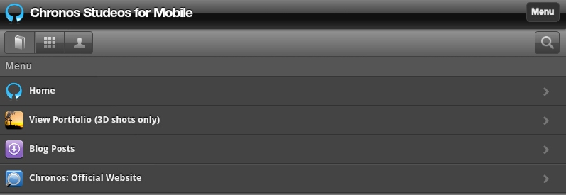


The new mobile-browsing experience on our blogsite…
We are excited to announce our migration to the mobile platform. Following recent trends in our growing base of mobile users, we have taken the step to make our blog site even more friendly as clients, readers, subscribers and the entire public can now read posts and view our works on-the-go.
The blogsite has been optimized for all mobile devices and tablets covering over a hundred mobile agents & providers. You will be amazed at the speedy transitions of the pages. We have brought you closer to the “faster-speed, less-waiting, more browsing” experience.

What you stand to gain…
Join hundreds of readers with easy access to our blog posts
Our migration will improve your overall browsing experience
Compatibility across all blackberry OS, android and iOS platforms
Ease of navigation via the menu button
You will download our free content much faster than before
Your social media connectivity is simplified by share icons
You can link up from any of our pages to see recent works and blog posts
You can access our pages from any internet-enabled devices
Portfolio images load faster and you can zoom to see details
You can share post contents with your followers on-the-go
How it works…
Click this link on your mobile device to confirm compatibility & easy navigation
