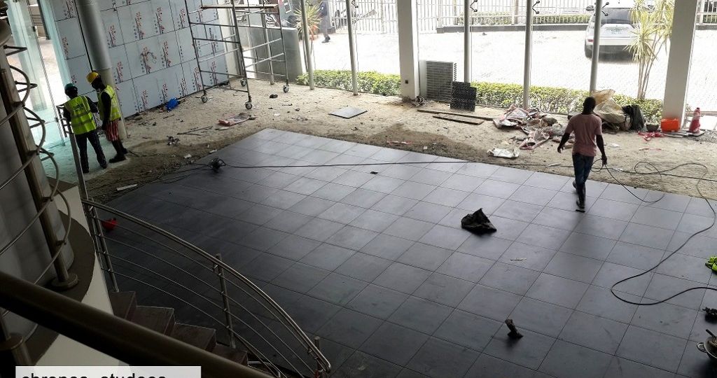
It was a white space with lots of glass, sunlight, and white walls. Somewhat clinical. Our design brief was simple, revamp, renew, renovate. It was a pleasure giving the three diamonds a befitting showroom space, giving their customers something to remember when they leave the showroom. This is a brief summary of the design journey to the Mitsubishi showroom facelift.

First, the Mood Board. Every design journey starts with a collection of images. To do this we needed to understand the history of our client. After extensive research, we collected pictures of showrooms around the world after which it was narrowed down to the design template of the brand.
3D MODELLING
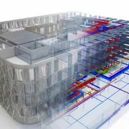
A crucial stage to any design development, Precision drawings, and 3D Models assist not just the clients but all parties involved, from the designers to the artisans and other workmen. Detailed shop drawings reduce wastage which saves money in the long run. Most importantly the visualization realistically adjusted expectations and possibilities. It puts clients at ease to see what they are paying for plus it carries them along the design process as they make decisions along the way.


COLOUR SELECTION
The initial challenge was making a strong impression with the brand’s primary red colour. Psychologically red is energetic, hot, the colour of extremes. How to tame it, without losing the vibe? We solved this by balancing the clinical white look of the showroom with linear occurrences of brilliant red, and matte black tiles.
DISPLAY WALL
Our client had a peculiar request. A black wall, Yes a black display wall. We struggled with incorporating that option for a while. A black wall while visually commanding would have subdued the other elements so we met halfway. A light grey cladded wall with black car brand signage names evenly distributed along the wall stretch. It was perfect!
TILE SELECTION
It had to be sleek! There is a lot that goes into tile selection and execution, the size, colour, texture, laying pattern, and grout used. A beautiful, high-quality tile sample means nothing if it is poorly laid. We presented as many a wide sample range to the client, they opted for sleek 600mm by 600mm Black Matte Fiandre, Italian tiles. Each piece was carefully laid with medium grey grout finish. It embodied the very word the client used…Sleek!
CLADDING
It was a different ball game having to work on curved walls (which were originally not constructed to perfection). Along the line, the original cladding panels were not looking best so we opted for the single curved sheets and modified our original drawings as shown in the gallery.
LOUNGE
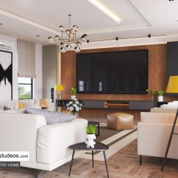
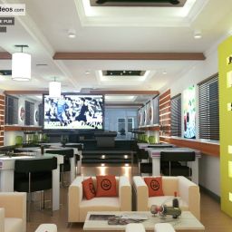
Have a seat. We guarantee you cannot resist. Following our client’s request for the lounge fill with parquet floor tiles, these carefully crafted bucket sofas spiced with red throw pillows were the ideal selection paired with a soft low cut shaggy rug. Round glass bowls filled with white stones line the wall edge just under the TV screen, it really pops against 1200mm x 200mm light wood ceramic parquet wood floor veneer. The ace on the hole was the centre lighting. A simple ocean wave patterned chandelier.
LIGHTING
Poorly planned lighting in a beautiful space can be likened to an ugly stain on an expensive shirt. For the showroom, it would have been wasteful to change all the existing lights, so we worked around what was existing. We created track lights to highlight the display wall featuring the client’s automobile list. A difference from the warm whites off the spotlights, it draws the gaze upwards, ultimately getting the required attention.
ART
It is an automobile display area, a race track decal comes to mind. On a semi-circular 6m high wall, application of the decal was somewhat clumsy but we did it (someone we will not mention got strapped in safety gear and climbed a long ladder to install it). At 1.2m each apart, the strips span about 2.4m across and 1m high. To complete the look, we installed a simple, classy five bulb decorative element.
SIGNAGE/LOGO
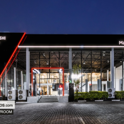
The showroom would not be complete if the signage was absent. Our design team took care and precision to reproduce the Mitsubishi Logo according to the brand guidelines. It was fun getting to install them with the lights and yes, the showroom looks amazing at night.
Essentially a showroom should be all about Show off, the belle of the ball, the only woman in the room or in this case. To do this, one must understand her looks, skin colour, figure and basically what works for her. So we approached it hence, we dressed her up!
More photos in the gallery below
ALL DONE AND DUSTED..!
As with every project, there were hurdles that were taken care of. It is a unique experience, a design journey with every client. We don’t stop until you are satisfied. So you have that space you want to make look great? What are you waiting for? Call us today or send us an e-mail. Chronos Studeos at your service. You can see more of our projects here.
Cheers!
Meet the Team
The following Chronos Studeos teammates worked to ensure the success recorded on this project:
Hassan Anifowose – Architect & Co-founder at Chronos Studeos
Olufon Tosin – Lead Interior designer at Chronos Studeos
James Adekunle – 3D Visualizer at Chronos Studeos
Emmanuel Akintayo – Architect at Chronos Studeos
Oshikoya Olumide – Architect at Chronos Studeos
Enioluwa Aiyejusunle – Architect/3D Artist at Chronos Studeos
Showroom photo credits to our friends at Bezalel Force Studios. Please do check out their works here.





Great job. I really like this make-over. It is impressive. The decals on the wall are also a great finishing touch.